Designing An On-Demand Amenities feature
Here’s a live prototype of my solution:
Brief:
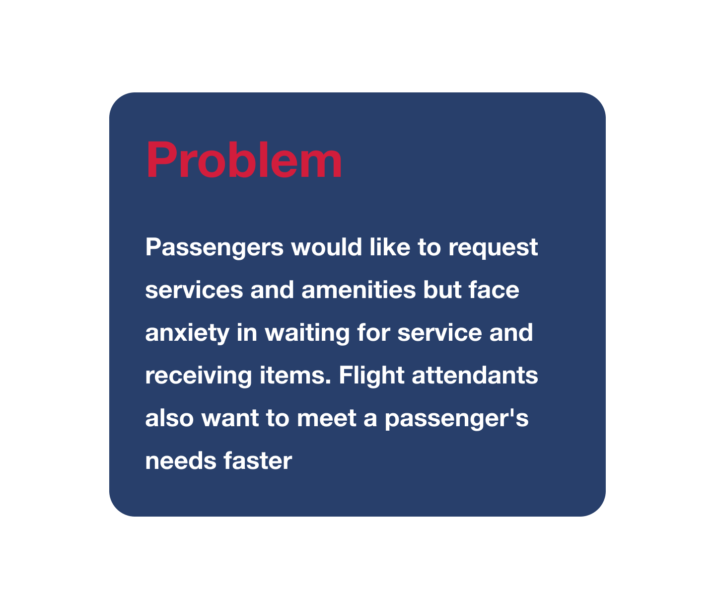
Make in-flight services available to passengers on their mobile devices.
In-flight services are manual (food and drink service, summoning an attendant), or limited to the headrest console.
Design a way for passengers to access these services through the existing Fly Delta app or website.
Must include features:
Request for services or amenities by paging a flight attendant.
Utilize the built-in entertainment displays to view movies, listen to music, play games, and view flight information.
Purchase Wi-Fi on their devices.
Shop duty-free through Delta SkyMiles® Marketplace and Sky Magazine.
Client:
Delta Airlines (Concept Project)
Tools:
Sketch, InVision, Google Forms
Marker, Paper, pen, Whiteboard
Team:
My Role: UX Researcher, UX Designer
My Team: UX Designer, Content Strategist
Discover
This would be an app to be used by passengers during a flight. To really understand a passenger's need, I needed to dig deeper, so I conducted research to understand who the users actually are and be able to identify their needs and goals.
Competitive Analysis
I started first by looking at other airlines doing similar things. I looked at what their key features were to assess what made them individually successful and what their shortcomings were. This analysis gave me a good understanding about what features to consider including in my solution and why this contributed to their success.
Site Map
User Flows
User Survey
To give me a scope of what the essence of the problem, I conducted a survey with 56 respondents to learn more about the users. Here’s some of my findings:
I found that nearly 28% of our users fly at least once a month and nearly 8% fly every 2 weeks. So why was it that almost 44% did not use amenities or in-flight services at all? I set out to find out.
Define
With the accumulation of all this research, it was now time to synthesize all the data that would inform the future design decisions.
Primary Persona
Discovering who I was crafting a solution for helped me identify their needs as a user. With all the data synthesized, I identified a primary persona. Here we have Anxious Andy:
Design
Concept design
After some initial sketches, I designed a paper prototype in order to run early usability tests that would inform later design decisions.
Wireframes & Prototypes
Testing
Style Guide
Iterations & Visual design
Deliver
Live Prototype
Finally, you’ve arrived to your destination. Below is a live clickable prototype. Click through it to see the solution I came to.
Final Thoughts
in the future:
the ability to download movies prior to flight (expiring 2 hours after arrival) to free up wifi bandwidth in-flight
compatibility with wearable devices (Apple watch, Fitbit, Samsung gear) to hail an attendant for basic amenities
Potential to pay via NFC (Apple pay, Samsung pay) to avoid having to use physical cards or saving payment types to app
A tablet and desktop version would expand the application usage rate to generate more revenue
*I am not affiliated with Delta Airlines in any way. This case study’s purpose was to
conceptualize how I would improve their existing product’s user experience.*


